Title records in the UNT Libraries’ Digital Collections

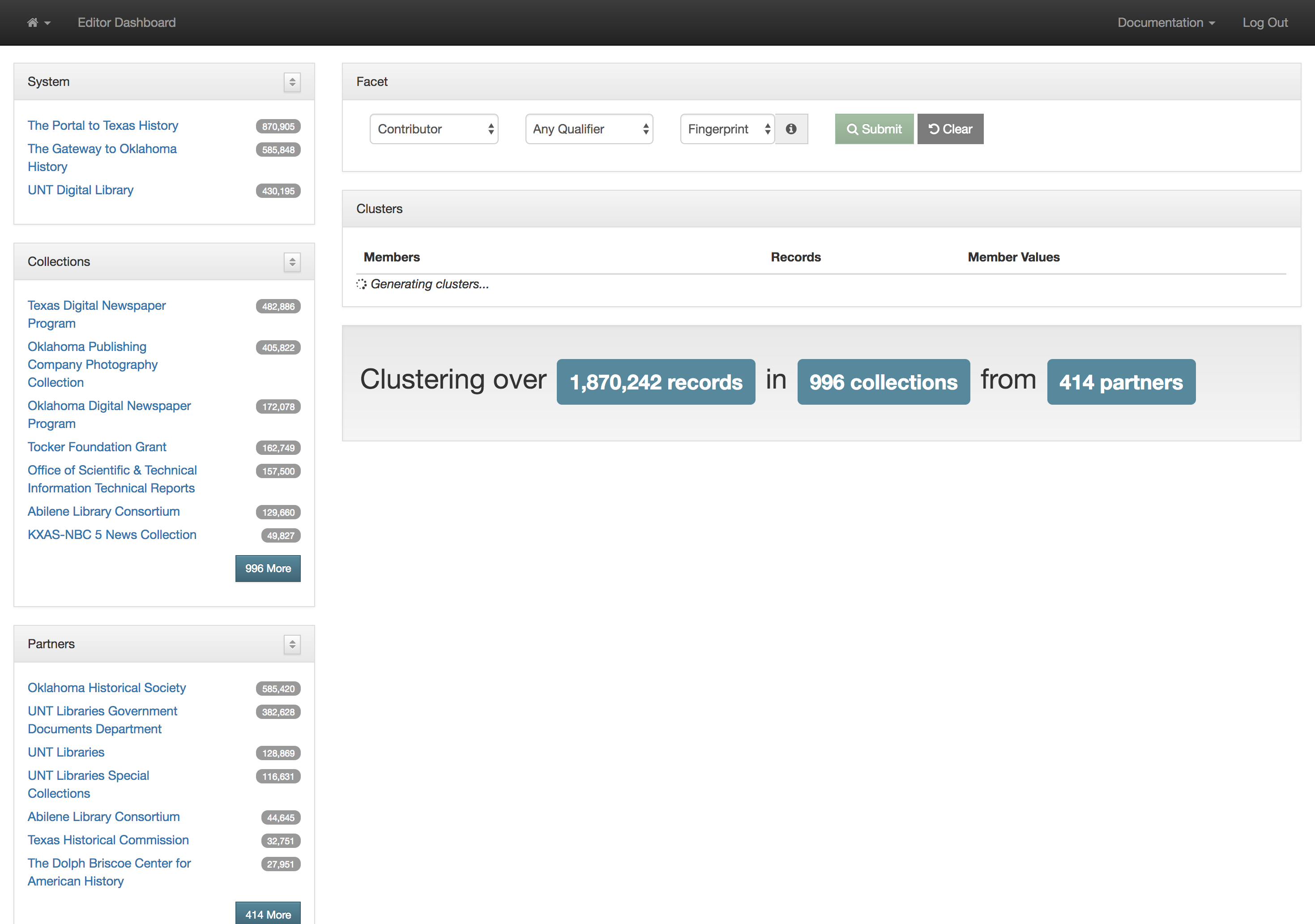
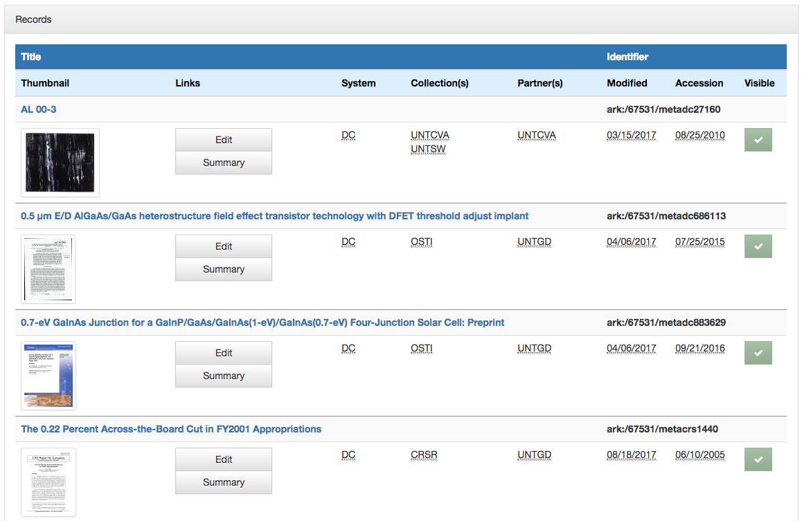
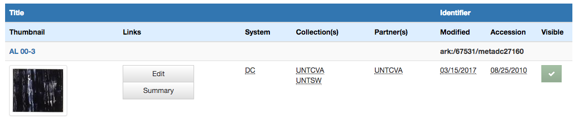
Titles for things are a concept that at one level seem very easy and straightforward. When you think of a book, it is usually pretty easy to identify the title of said book. When you start thinking about newspapers or other periodicals like magazines or journals, they are also usually pretty straightforward. You might think about The New York Times, or National Geographic, or maybe a local publication like the Denton Record-Chronicle. But when you start to work with many items in a library situation and have to represent the wide range of title variations, merging, splitting, publications with the same name, things get … messy.

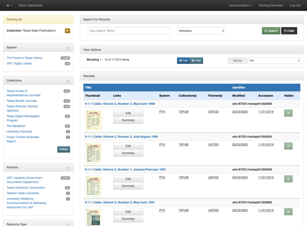
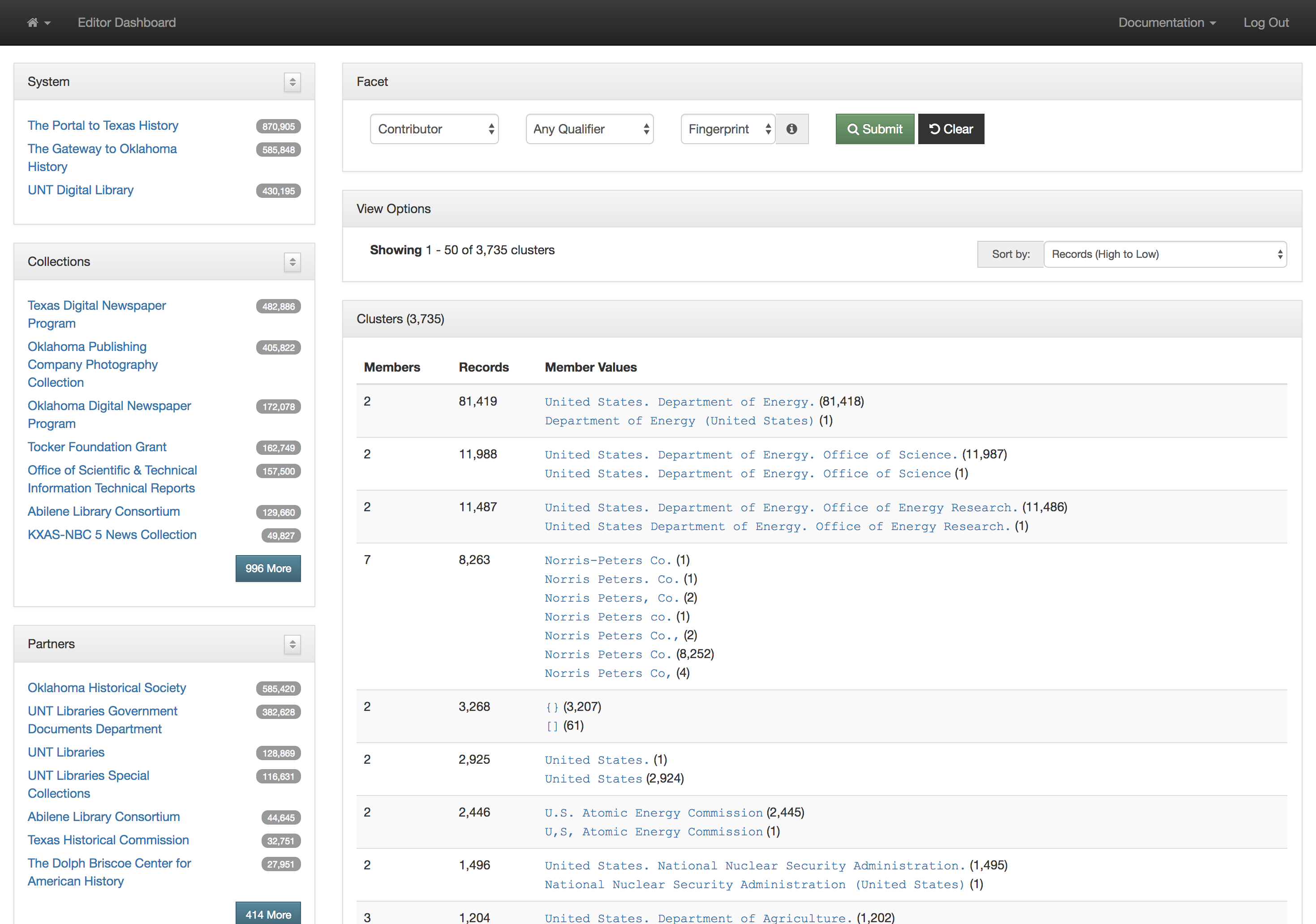
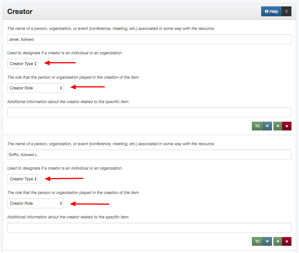
Over the past 15 years, the UNT Libraries has approached managing serial and series titles in our digital collections by establishing two title qualifiers, serialtitle and seriestitle and then populating title fields using those qualifiers as appropriate. These qualified titles are then indexed so that they will show up in our facet lists and be searchable throughout the records as general metadata. We can also make use of them in situations when we want to identify a specific records with that title from the whole system. In our interfaces we highlight the existence of serial and series titles that occur more than once to try and lead our users to additional issues within a title.

Screenshot of the Solutions Volume 17, Number 1, Fall 2019 publication as presented in The Portal to Texas History
Example from The Portal to Texas History that links to 31 other issues of the title Solutions.

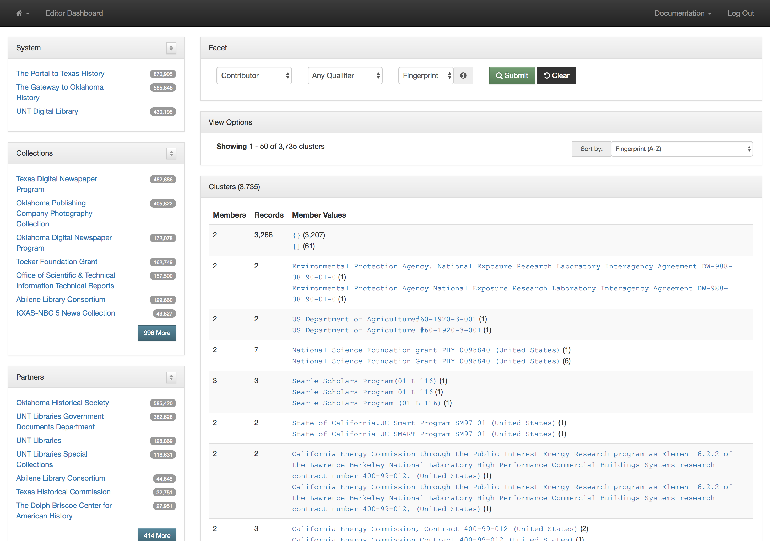
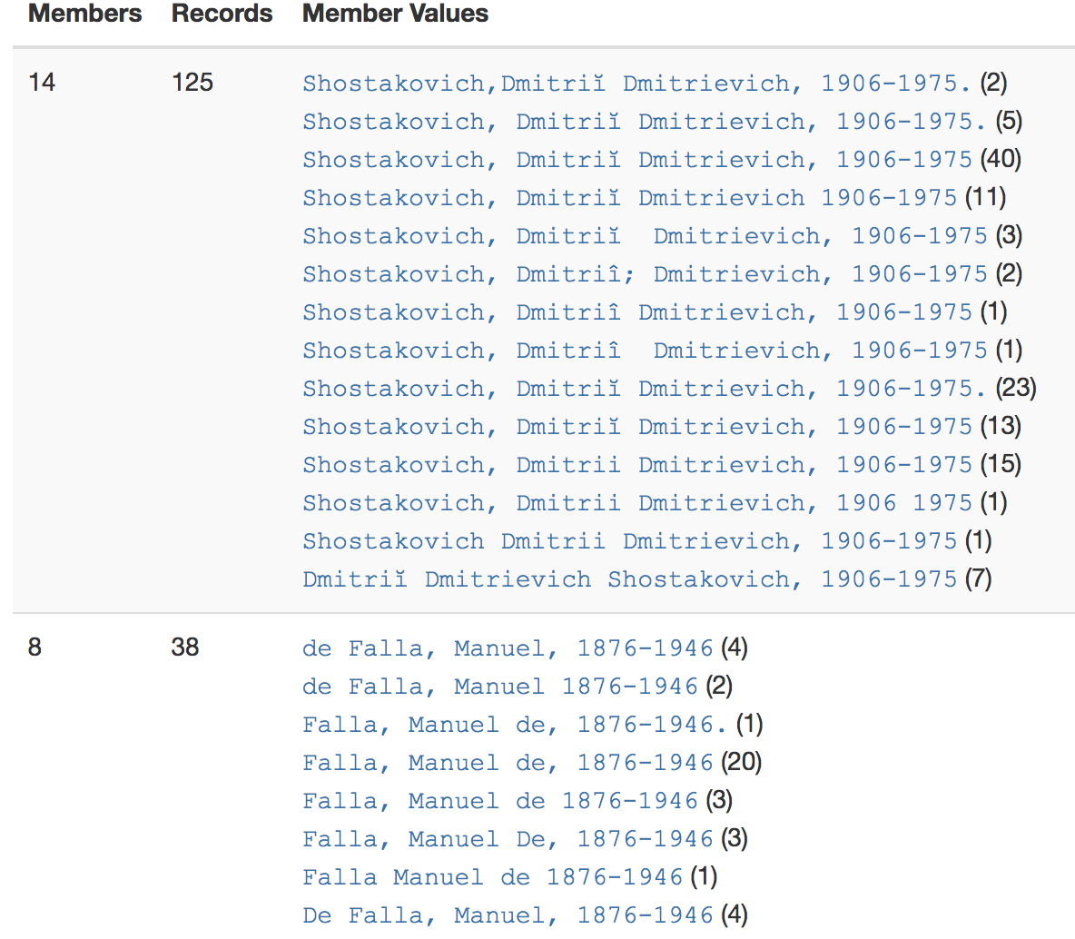
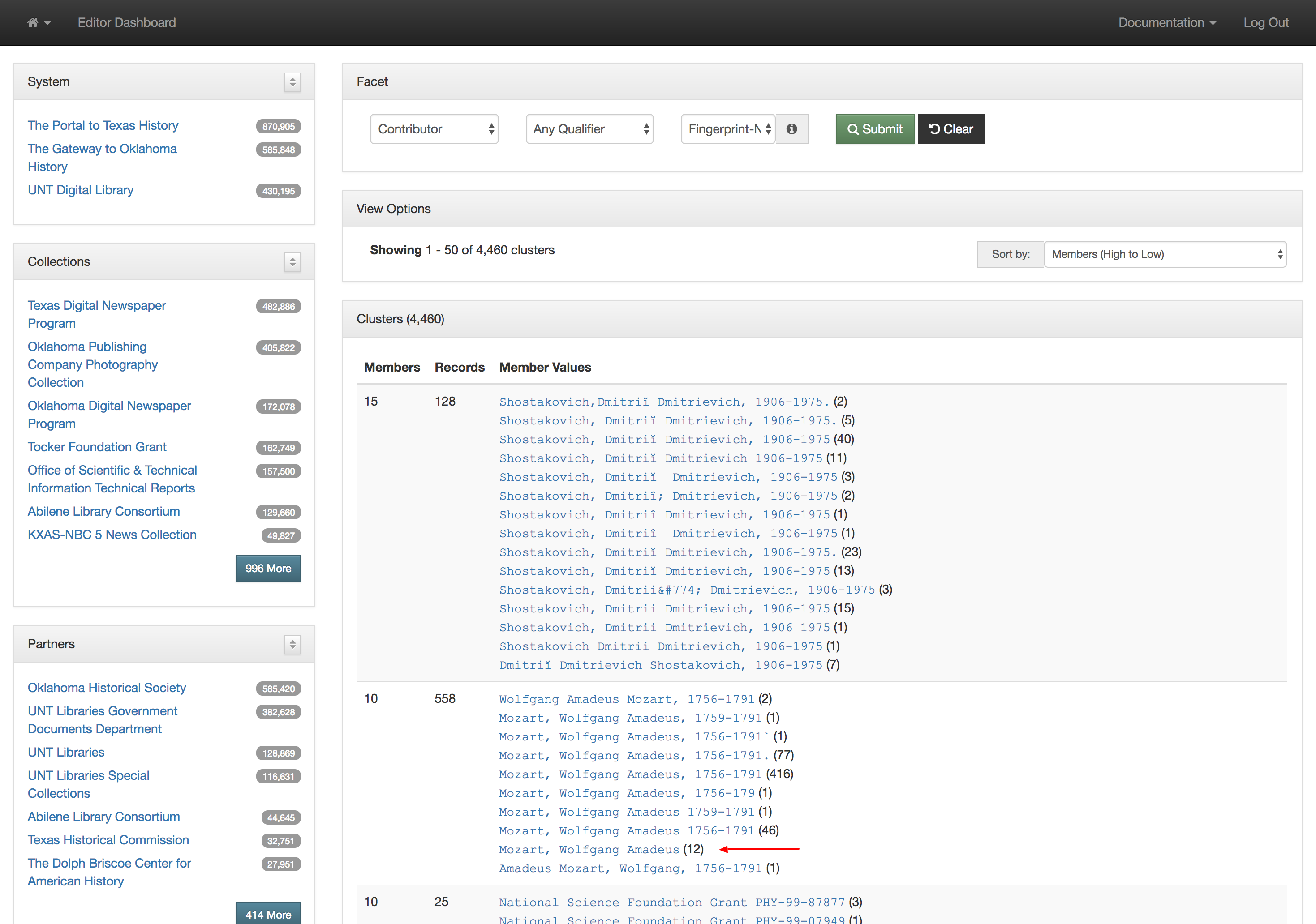
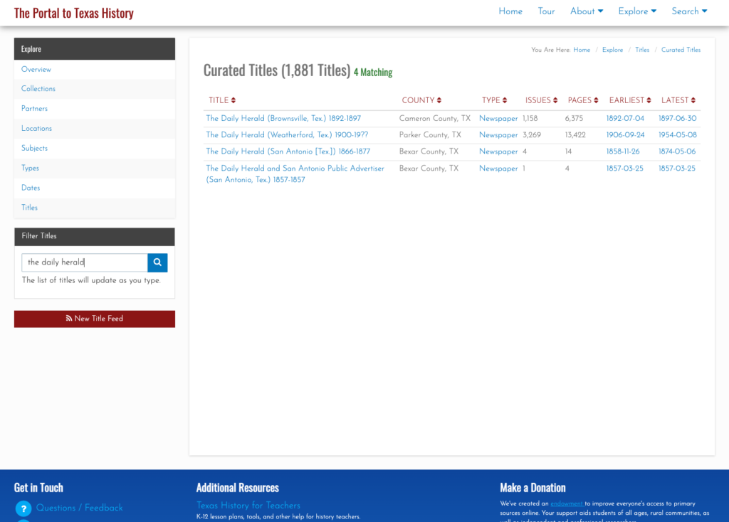
This actually works pretty well for many situations but there are a few things that cause it not to be so great. The first area this causes problems is when you have multiple publications that share the same name but that are in fact different publications. This happens somewhat often in the newspaper publishing world and since we have been trying to build large collections of newspapers from both Texas and Oklahoma, this has caused some challenges. One way of combatting this with newspapers specifically is to use a more unique version of the title. For example The Daily Herald was published in at least four different counties, Bexar, Cameron, Lamar, and Parker. In this case they represent four different titles though they share the same name. Instead of our current practice of putting The Daily Herald as the serial title we could have used The Daily Herald (Weatherford, Texas) or something similar to make it a bit clearer.

Another area that is challenging is the way that titles change over time. The example I gave at the beginning of this post of the Denton Record-Chronicle shows the merging of two different titles the Denton Record and the Denton Chronicle at some point in the past. These preceding, succeeding, or related titles are not easily managed with the simple system that we had in place in our system.

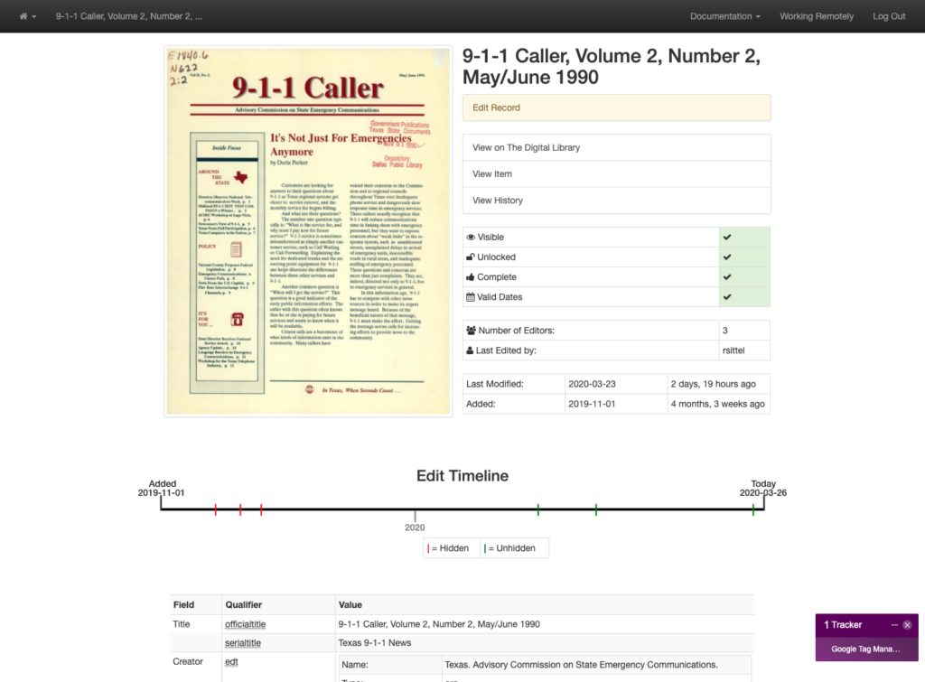
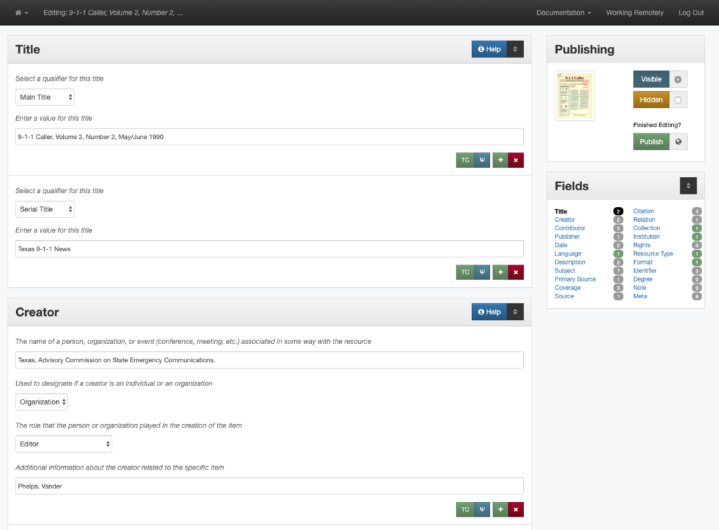
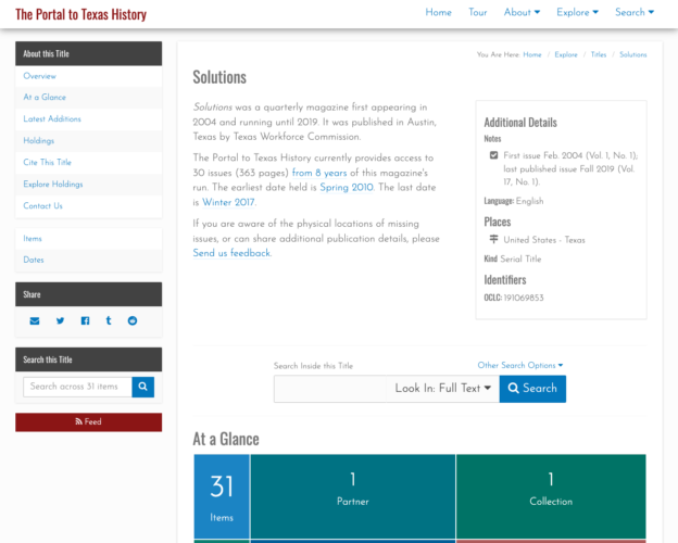
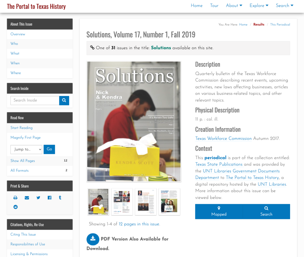
Finally when you want to link directly to a title in one of our digital library interfaces we are forced to link directly into our search interface, which results in URLs that people will include in other places that we are not going to be able to honor forever. An example of this is for the Solutions publication in the images above. Here is the resulting URL for this title in the system currently. https://texashistory.unt.edu/search/?fq=str_title_serial:%22Solutions%22

Titles as Things

Over the past year we have been working to untangle ourselves from our early title implementation. We wanted to design a system that would give us unique identifiers and URLs for each title that we are curating in our systems. We wanted to be able to connect titles together whenever appropriate. We wanted to be able to document metadata about the title itself like start and end years, place of publication, publisher, publishing frequency, language, and notate other identifiers like LCCN, OCLC, or ISSNs for a given title.

Another goal of the implementation was that we wanted to have a lightweight system that worked on top of existing records. We didn’t want to have to change over a million records to directly include this new title identifier in each metadata record. Instead we chose to work with existing OCLC and LCCN identifiers when they were available in records and directly include the title identifiers if there isn’t an OCLC or LCCN already created for the title.

With these ideas in mind we started to look at other implementations. We looked mainly at other large digital newspaper projects both in the US and around the world to see how they were approaching this space. We added a few requirements from this survey to our goals, primarily, the ability to have descriptions or essays about the title and the ability to further group titles into title families or other groupings.

We started our implementation with the base models from the Open Online Newspaper Initiative (Open ONI) which provided a great starting point. We also cribbed some features from the Georgia Historic Newspapers implementation as we thought they would be useful in our system.

We decided that each title would have an identifier minted with a t followed by a five digit, zero-padded number resulting in an identifier that looks like this t03303. To allow for the inclusion of these identifiers in records, we would introduce a new identifier qualifier, UNT-TITLE-ID in our UNTL Metadata Scheme.

Screenshot for the title Solutions in The Portal to Texas History
Title page for Solutions in The Portal to Texas History

Now that we are able to create records for titles, the Solutions example that we used above has a Title Record in our system that we can link to and reference. In this case the URL is https://texashistory.unt.edu/explore/titles/t03303/

Search, At a Glance, and Latest Addition features on Title page.

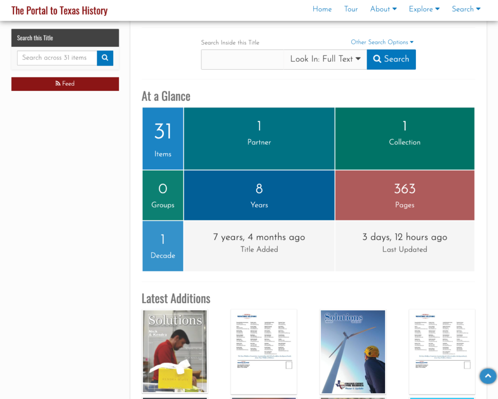
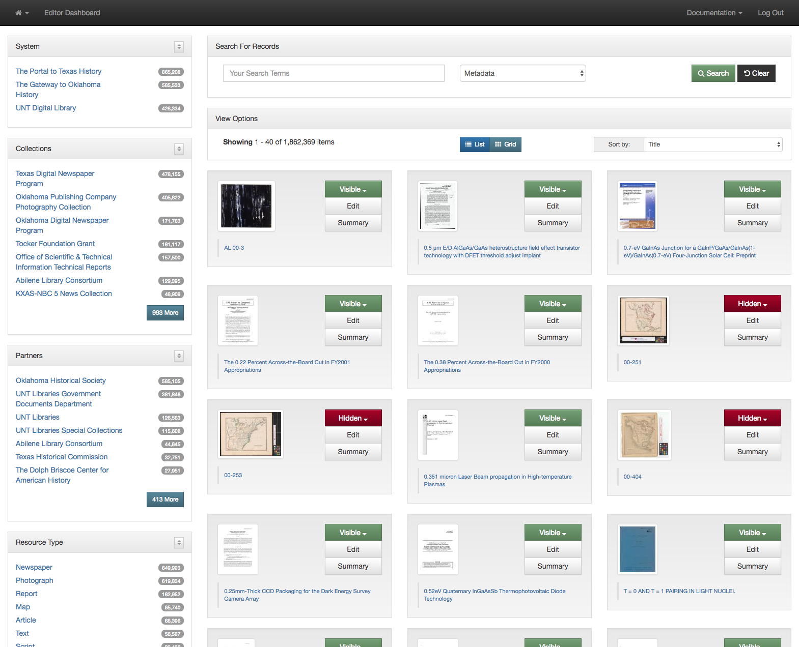
We tried to reference the design of the Collection and Partner pages in our new Title pages with the ability to search within a title and see an overview of some of the important metrics in the “At a Glance” section. Finally we show the most recently added issues of this publication in the “Latest Additions” section.

Browse by Date

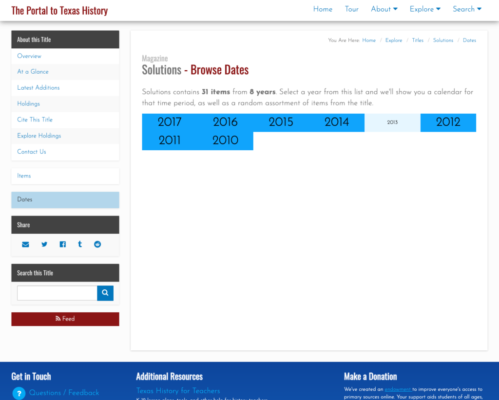
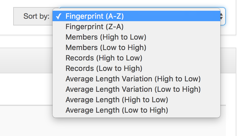
One of the more useful views that we are now able to provide is the “Dates” view. This allows a user to quickly see the years that are held for a publication. When a user clicks on a year they are given a calendar view so that they can select the month or date of the publication they are interested in viewing.

Browse Items

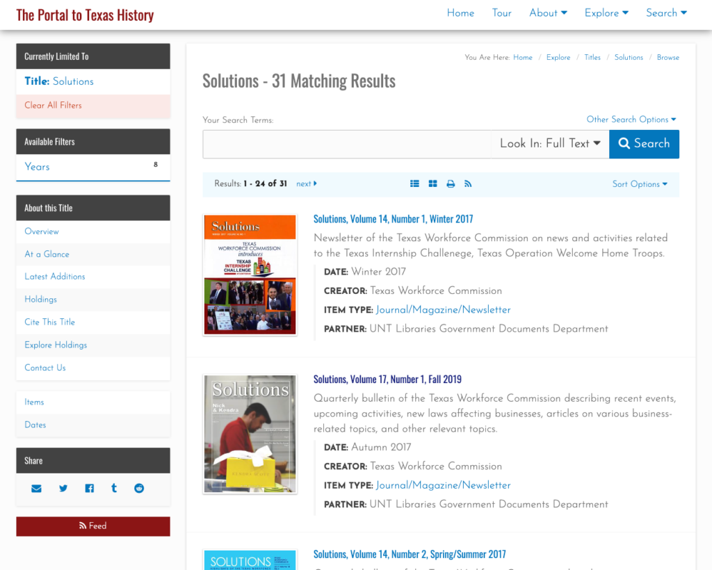
Finally, a users is able to view and search all of the issues of a title. This replicates the search interface and there are similar views in Collection and Partner pages that match this functionality. The full set of facets are available on the left to further drill into the content that the user is after.
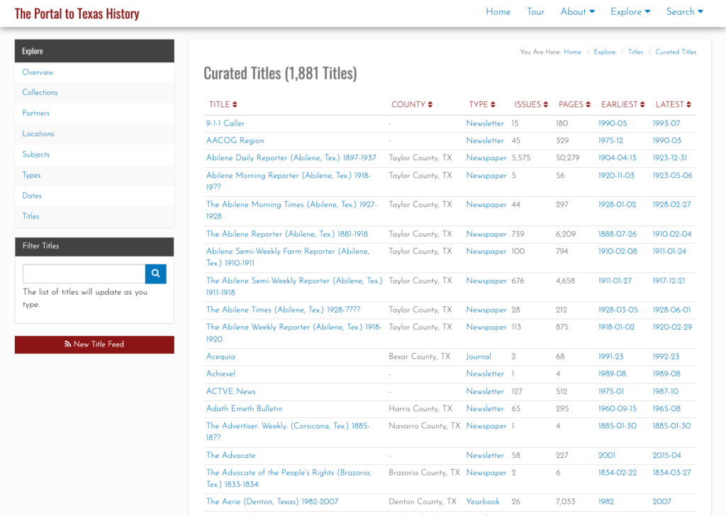
Curated Titles

Now that we have a way of explicitly defining and describing titles in our systems we can pull those together into interfaces. The first page that we created was our curated title page (https://texashistory.unt.edu/explore/titles/curated/) which pulls together the currently available titles in one of our interfaces.

You can see the improvement for users who might be interested in looking at “The Daily Herald” like I mentioned at the top of this post. Now they are able to quickly distinguish between the different instances of this title and get to the one they are looking for.

All the other pieces.

I’ve presented a pretty high-level overview of the work that we have been doing for titles in The Portal to Texas History, the UNT Digital Library, and the Gateway to Oklahoma History. There are a ton of details that might be interesting such as the “not_in_database” helper that we created to identify titles that exist in the system but which do not have title record yet. We also completely overhauled the way we think about place names as part of this work, giving them their own models in a similar way as we did for the Titles. We also had to come up with a mechanism to represent holdings information so that we can quickly display that to users and systems when they request it from the titles interface. If there is interest in these topics I would be happy to write them up a bit.

If you have questions or comments about this post,  please let me know via Twitter or Mastodon.

User Session Analysis: UNT Scholarly Works

This is a continuation of a series of posts that I never got around to writing earlier this semester.  I posted the first and second post in the series in February but never got around to writing the rest of them.  This time I am looking at if users use items from multiple collections in the UNT Digital Library.

The dataset I am using is a subset of the 10,427,111 user sessions logged in the UNT Libraries Digital Collections in 2017.  This subset is specifically for the UNT Scholarly Works Repository.  There are a total of 253,369 sessions in this dataset and these have been processed in the same way as was mentioned in previous posts.

Of these 253,369 sessions, there were 223,168 that were sessions that involved interactions with a single item.  This means 88% of the time when a user made use of an object in the UNT Scholarly Works Repository, it was for just one item.   This leaves us 30,201 of the sessions in 2017 that would be interesting to look at for our further analysis.

Items Accessed Sessions Percentages of All Sessions
1 223,168 88.08%
2 17,627 6.96%
3 5,009 1.98%
4 2,267 0.89%
5 1,285 0.51%
6 824 0.33%
7 598 0.24%
8 404 0.16%
9 270 0.11%
10 204 0.08%
11 150 0.06%
12 96 0.04%
13 94 0.04%
14 63 0.02%
15 41 0.02%
16 42 0.02%
17 50 0.02%
18 45 0.02%
19 50 0.02%
20 264 0.10%
30 147 0.06%
40 135 0.05%
50 117 0.05%
60 43 0.02%
70 39 0.02%
80 40 0.02%
90 33 0.01%
100 123 0.05%
200 52 0.02%
300 33 0.01%
400 19 0.01%
500 6 0.00%
600 8 0.00%
700 6 0.00%
800 6 0.00%
900 2 0.00%
1000 9 0.00%

Based on what I see in this table I’m choosing 11 item uses as the cutoff point for further analysis.  This means that I will be looking at all of the sessions that have 2 – 11 items per session.  This is 11% of the 253,369 UNT Scholarly Works sessions and 95% of the sessions that have more than one item used. This represents 28,638 user sessions we are analyzing in the rest of this post..

Looking at the Sessions

With the dataset layout we have we can easily go through and look at the Partners, Resource Types, and finally the Collections used per session.  Let’s get started.

The first category we will look at are the Partners present in the sessions.  In the UNT Scholarly Works collection there is generally a single Partner field for a record.  This Partner is usually the contributing college, department, or center on campus where the author of the resource is contributing from.  The model is flat and doesn’t allow for any nuance for multiple authors from different colleges but seems to work pretty well for many of the items in the repository.  As I said there is generally a one-to-one relationship between an object and a Partner field in the dataset.

UNT Scholarly Works: Partners per Session

From the Partners Per Session graph we can see that there are many sessions that make use of items from multiple Partners in a single session.  In fact 66.7% of the sessions that accessed 2-11 items made use of items from more than one Partner.  To me that is really telling that there are discoveries being made that span disciplines in this collection.  So a user could pull an article that was contributed by the College of Information and in the same session pull up something that is from the College of Music. That’s pretty cool.

The next thing we can look at is the number of different resource types that are used in a given session.  There is generally one resource type per digital object.  These resource types could be an Article, a Book Chapter, a Report, a Poster, or a Presentation.  We are interested in seeing how often a session will include multiple different types of resources.

UNT Scholarly Works: Types per Session

In looking at the graph above we can see that for sessions that included between 2 and 11 items there were 76% of the sessions where users made use of items that were different types.

The final area we will look is at the collections per session.  This is a little bit messier to explain because it is possible (and common) for a single digital object to have multiple collections.  We had to take this into account in the way that we counted the collections per session.

UNT Scholarly Works: Collections per Session

This graph matches the same kind of pattern that we saw for Partners and Resource types.  For sessions that used between two and eleven items 75% of the sessions used two or more different collection combinations.  This means that when a user looked at two or more different records there was a very high chance that they were going to be pulling up a digital object that was from another collection in the UNT Digital Library.

So how does this happen?  I can come up with four different ways that this can happen.

  1. A user is using the main search on https://digital.library.unt.edu/ and just pulls up items that are from a number of collections.
  2. A user is searching one of the combined search interfaces we have for the library that includes all 2 million metadata records in the UNT Libraries Digital Collections.
  3. A user is coming to our content from a google search that lands them in a collection and they navigate more broadly to get to a resource.
  4. A user has multiple different browser tabs open and might even have two different search tasks going on but they are getting combined into one session because of the way we are grouping things for this analysis.

There are probably other ways that this is happening which might be a good thing to look at in more depth in the future.  I looked briefly at the full list of collections that get used together and some of the combinations aren’t immediately interpretable with a logical story of how these items were viewed together within a session.  The Web gets messy.

Cross-Collection Sessions

In looking at the number of sessions that spanned more than one collection I was interested in understanding which collections were most used with the UNT Scholarly Works Repository collection.

I took all of the collections present in each session and created pairs of collections in the form of (‘UNTSW’, ‘UNTETD’) or (‘UNTSW’, ‘TRAIL’). These were then grouped and then the results placed into a table to show how everything matches up.

UNTSW UNTETD OSTI TRAIL OTA TDNP MDID CRSR JNDS UNTGW
UNTSW 0 11,147 1,938 1,126 1,121 1,118 952 703 676 302
UNTETD 11,147 0 323 258 895 80 230 175 59 63
OSTI 1,938 323 0 165 9 48 3 91 28 8
TRAIL 1,126 258 165 0 19 44 16 63 11 14
OTA 1,121 895 9 19 0 2 60 15 5 4
TDNP 1,118 80 48 44 2 0 0 17 4 12
MDID 952 230 3 16 60 0 0 3 2 1
CRSR 703 175 91 63 15 17 3 0 8 15
JNDS 676 59 28 11 5 4 2 8 0 0
UNTGW 302 63 8 14 4 12 1 15 0 0

The table needs just one piece of information to keep in mind.  When you start comparing collections that don’t include UNTSW you need to remember that because we limited our dataset to sessions that included UNTSW you should always add that into your interpretation.  For example if you were looking at how often do items from UNTETD (our theses and dissertation collection) get used with TRAIL (Technial Report Archive and Image Library collection) you will get 258 sessions.  But you also have to add into that UNTSW so it is really, how often does UNTETD, TRAIL and UNTSW get used together which is 258.

Just looking at the first column of the table will give us the collections that are most often accessed within sessions with the UNT Scholarly Works Repository.  I pulled those out into the chart below.

Cross-Collection Sessions

By far the most commonly used collection with the UNT Scholarly Works Repository collection is the UNT Theses and Dissertations collection. This occurs 39% of the time when there are two or more collections used in a session.  The other collections drop off very quickly after UNTETD.

This analysis is just another quick stab at understanding how the digital collections are being accessed by our users.  I think that there is more that we can do with this data and hopefully I’ll get around to doing a bit more analysis this summer.  There are still a few research questions from our original post that we haven’t answered.

If you have questions or comments about this post,  please let me know via Twitter.

Introducing Sampling and New Algorithms to the Clustering Dashboard

One of the things that we were excited about when we adding the Clustering Dashboard to the UNT Libraries’ Edit system was the ability to experiment with new algorithms for grouping or clustering metadata values.  I gave a rundown of the Cluster Dashboard in a previous blog post 

This post is going to walk through some of things that we’ve been doing to try and bring new data views to the metadata we are managing here at the UNT Libraries.

The need to sample

I’m going to talk a bit about the need to sample values first and then get to the algorithms that make use of it in a bit.

When we first developed the Cluster Dashboard we were working with a process that would take all of the values of a selected metadata element, convert those values into a hash value of some sort and then and identify where there were more than one value that produces the same hash.  We were only interested in the instances that contained multiple values that had the same hash.  While there were a large number of clusters for some of the elements, each cluster had a small number of values.  I think the biggest cluster I’ve seen in the system had 14 values.  This is easy to display to the user in the dashboard so that’s what we did.

Moving forward we wanted to make use of some algorithms that would result in hundreds, thousands, and even tens of thousands of values per cluster.  An example of this is trying to cluster on the length of a field.  In our dataset there are  41,016 different creator values that are twelve characters in length.  If we tried to display all of that to the user we would quickly blow up the browser for the user which is never any fun.

What we have found is that there are some algorithms we want to use that will always return all of the values and not only when there are multiple values that share a common hash.  For these situations we want to be proactive and sample the cluster members so that we don’t overwhelm the users interface.

Sampling Options in Cluster Dashboard

You can see in the screenshot above that there are a few different ways that you can sample the values of a cluster.

  • Random 100
  • First 100 Alphabetically
  • Last 100 Alphabetically
  • 100 Most Frequent
  • 100 Least Frequent

This sampling allows us to provide some new types of algorithms but still keep the system pretty responsive.  So far we’ve found this works because when you are using these cluster algorithms that return so many value you generally aren’t interested in the clusters that are the giant clusters. You are typically looking for anomalies that show up in smaller clusters, like really long or really short values for a field.

Cluster Options in Dashboard showing sampled and non-sampled clustering algorithms.

We divided the algorithm selection dropdown into two parts to try and show the user the algorithms that will be sampled and the ones that don’t require sampling.  The option to select a sample method will only show up when it is required by the algorithm selected.

New Algorithms

As I mentioned briefly above we’ve added a new set of algorithms to the Cluster Dashboard.  These algorithms have been implemented to find anomalies in the data that are a bit hard to find other ways.  First on the list is the Length algorithm.  This algorithm uses the number of characters or length of the value as the clustering key.  Generally the very short and the very long values are the ones that we are interested in.

I’ll show some screenshots of what this reveals about our Subject element.  I always feel like I should make some sort of defense of our metadata when I show these screenshots but I have a feeling that anyone actually reading this will know that metadata is messy.

Subject Clustered by Length (shortest)

Subject Clustered by Length (longest)

So quickly we can get to values that we probably want to change. In this case the subject values that are only one character in length or those that are over 1,600 characters in length.

A quick story about how this is useful.  We had a metadata creator a few years back accidentally pasted the contents of a personal email into the title field of a photograph because they just got their clipboard mixed up.  They didn’t notice this so it went unnoticed for a few weeks until it was stumbled on by another metadata editor.  This sort of thing happens from time to time and can show up with this kind of view.

There are a few variations on the length that we provide.  Instead of the number of characters we have another view that is the count of tokens in the metadata value.  So a value of “University of North Texas” would have a token count of 4.  This gives a similar but different view as the length.

Beyond that we provide some algorithms that look at the length of tokens within the values.  So the value of “University of North Texas” would have an Average Token Length of 5.5.  I’ve honestly not found a good use for the Average Token Length, Median Token Length, Token Length Mode, or Token Length Range yet but maybe we will?

Finally there is the Pattern Mask algorithm that was implemented primarily for the date field in our metadata records.  This algorithm takes in the selected metadata element values and converts all digits to 0 and all of the letters to an a.  It leaves all punctuation characters alone.

So a value of “1943” maps to “0000” or a value of “July 4, 2014” maps to “aaaa 0, 0000”.

Pattern Mask on Date Element

In the example above you can quickly see the patterns that we will want to address as we continue to clean up our date element.

As I mentioned at the beginning of the post, one of the things that we were excited about when we implemented the Cluster Dashboard was the ability to try out different algorithms for looking at our metadata.  This is our first set of “new” algorithms for the system.  We also had to add the ability to sample the clusters because the can quickly get crazy with the number of values.  Hopefully we will be able to add additional clustering algorithms to the system in the future.

Are there any ideas that you have for us that you would like us to try out in the interface?  If so please let me know, we would love to experiment a bit.

If you have questions or comments about this post,  please let me know via Twitter.

User Session Analysis: Investigating Sessions

In the previous post in this series I laid out the work that we were going to do with session data from the UNT Libraries’ Digital Collections.  In order to get the background that this post builds from take a quick look at that post.

In this post we are going to look at the data for the 10,427,111 user sessions that we generated from the 2017 Apache access logs from the UNT Libraries Digital Collections.

Items Per Sessions

The first thing that we will take a look at in the dataset is information about how many different digital objects or items are viewed during a session.

Items Accessed Sessions Percentage of All Sessions
1 8,979,144 86.11%
2 809,892 7.77%
3 246,089 2.36%
4 114,748 1.10%
5 65,510 0.63%
6 41,693 0.40%
7 29,145 0.28%
8 22,123 0.21%
9 16,574 0.16%
10 15,024 0.14%
11 10,726 0.10%
12 9,087 0.09%
13 7,688 0.07%
14 6,266 0.06%
15 5,569 0.05%
16 4,618 0.04%
17 4,159 0.04%
18 3,540 0.03%
19 3,145 0.03%
20-29 17,917 0.17%
30-39 5,813 0.06%
40-49 2,736 0.03%
50-59 1,302 0.01%
60-69 634 0.01%
70-79 425 0.00%
80-89 380 0.00%
90-99 419 0.00%
100-199 2,026 0.02%
200-299 411 0.00%
300-399 105 0.00%
400-499 63 0.00%
500-599 24 0.00%
600-699 43 0.00%
700-799 28 0.00%
800-899 20 0.00%
900-999 6 0.00%
1000+ 19 0.00%

I grouped the item uses per session in order to make the table a little easier to read.  With 86% of sessions being single item accesses that means we have 14% of the sessions that have more than one item access. This is still 1,447,967 sessions that we can look at in the dataset so not bad.

You can also see that there are a few sessions that have a very large number of items associated with them. For example there are 19 sessions that have over 1,000 items being used.  I would guess that this is some sort of script or harvester that is masquerading as a browser.

Here are some descriptive statistics for the items per session data.

N Min Median Max Mean Stdev
10,427,111 1 1 1,828 1.53 4.735

For further analysis we will probably restrict our sessions to those that have under 20 items used in a single session.  While this might remove some legitimate sessions that used a large number of items, it will give us numbers that we can feel a bit more confident about.  That will leave 1,415,596 or 98% of the sessions with more than one item used still in the dataset for further analysis.

Duration of Sessions

The next thing we will look at is the duration of sessions in the dataset.  We limited a single session to all interactions by an IP address in a thirty minute window so that gives us the possibility of sessions up to 1,800 seconds.

Minutes Sessions Percentage of Sessions
0 8,539,553 81.9%
1 417,601 4.0%
2 220,343 2.1%
3 146,100 1.4%
4 107,981 1.0%
5 87,037 0.8%
6 71,666 0.7%
7 60,965 0.6%
8 53,245 0.5%
9 47,090 0.5%
10 42,428 0.4%
11 38,363 0.4%
12 35,622 0.3%
13 33,110 0.3%
14 31,304 0.3%
15 29,564 0.3%
16 27,731 0.3%
17 26,901 0.3%
18 25,756 0.2%
19 24,961 0.2%
20 32,789 0.3%
21 24,904 0.2%
22 24,220 0.2%
23 23,925 0.2%
24 24,088 0.2%
25 24,996 0.2%
26 26,855 0.3%
27 30,177 0.3%
28 39,114 0.4%
29 108,722 1.0%

The table above groups a session into buckets for each minute.  The biggest bucket by number of sessions is the bucket of 0 minutes. This bucket has sessions that are up to 59 seconds in length and accounts for 8,539,553 or 82% of the sessions in the dataset.

Duration Sessions Percent of Sessions Under 1 Min
0 sec 5,892,556 69%
1-9 sec 1,476,112 17%
10-19 sec 478,262 6%
20-29 sec 257,916 3%
30-39 sec 181,326 2%
40-49 sec 140,492 2%
50-59 sec 112,889 1%

You might be wondering about those sessions that lasted only zero seconds.  There are 5,892,556 of them which is 69% of the sessions that were under one minute.  These are almost always sessions that used items as part of an embedded link, a pdf view directly from another site (google, twitter, webpage) or a similar kind of view.

Next Steps

This post helped us get a better look at the data that we are working with.  There is a bit of strangeness here and there with the data but this is pretty normal for situations where you work with access logs.  The Web is a strange place full of people, spiders, bots,  and scripts.

Next up we will actually dig into some of the research questions we had in the first post.  We know how we are going to limit our data a bit to get rid of some of the outliers in the number of items used and we’ve given a bit of information about the large number of very short duration sessions.  So more to come.

If you have questions or comments about this post,  please let me know via Twitter.

User Session Analysis: Connections Between Collections, Type, Institutions

I’ve been putting off some analysis that a few of us at the UNT Libraries have wanted to do with the log files of the UNT Libraries Digital Collections.  This post (and probably a short series to follow) is an effort to get back on track.

There are three systems that we use to provide access to content and those include: The Portal to Texas History, the UNT Digital Library, and the Gateway to Oklahoma History.

In our digital collections there are a few things that we’ve said over time that we feel very strongly about but which we’ve never really measured.  First off we have said that there is value in co-locating all of our content in the same fairly uniform system instead of building visually and functionally distinct systems for different collections of items.  So instead of each new project or collection going into a new system, we’ve said there is not only cost savings, but real value in putting them all together in a single system.  We’ve said “there is an opportunity for users to not only find content from your collection, but they could find useful connections to other items in the overall digital library”.

Another thing we’ve said is that there is value in putting all different types of digital objects together into our digital systems.  We put the newspapers, photographs, maps, audio, video, and datasets together and we think there is value in that.  We’ve said that users will be able to find newspaper issues, photographs, and maps that might meet their need.  If we had a separate newspaper system, separate video or audio system some of this cross-type discovery would never take place.

Finally we’ve said that there is great value in locating collections from many institutions together in a system like The Portal to Texas History.  We thought (and still think) that users would be able to do a search and it will pull resources together from across institutions in Texas that have matching resources. Because of the geography of the state, you might be finding things that are physically located 10 or 12 hours away from each other at different institutions. In the Portal, these could be displayed together, something that would be challenging if they weren’t co-located in a system.

In our mind these aren’t completely crazy concepts but we do run into other institutions and practitioner that don’t always feel as strongly about this as we do.  The one thing that we’ve never done locally is look at the usage data of the systems and find out:

  • Do users discover and use items from different collections?
  • Do users discover and use items that are different types?
  • Do users discover and use items that are from different contributing partners?

This blog post is going to be the first in a short series that takes a  look at the usage data in the UNT Libraries Digital Collections in an attempt to try and answer some of these questions.

Hopefully that is enough background, now let’s get started:

How to answer the questions.

In order to get started we had to think a little bit about how we wanted to pull together data on this.  We have been generating item-based usage for the digital library collections for a while.  These get aggregated into collection and partner statistics that we make available in the different systems.  The problem with this data is that it just shows what items were used and how many times in a day they were used.  It doesn’t show what was used together.

We decided that we needed to go back to the log files from the digital collections and re-create user sessions to group item usage together.  After we have information about what items were used together we can sprinkle in some metadata about those items and start answering our questions.

With that as a plan we can move to the next step.

Preparing the Data

We decided to use all of the log files for 2017 from our digital collections servers.  This ends up being 1,379,439,042 lines of Apache access logs (geez, over 1.3 billion, or 3.7 million server requests a day).  The data came from two different servers that collectively host all of the application traffic for the three systems that make up the UNT Libraries’ Digital Collections.

We decided that we would define a session as all of the interactions that a single IP address has with the system in a 30 minute window.  If a user uses the system for more than 30 minutes, say 45 minutes, that would count as one thirty minute session and one fifteen minute session.

We started by writing a script that would do three things.  First it would ignore lines in the log file that were from robots and crawlers.  We have a pretty decent list of these bots so that was easy to remove.  Next we further reduced the data by only looking at digital object accesses.  Specifically lines that looked something like ‘/ark:/67531/metapth1000000/`. This pattern in our system denotes an item access and these are what we were interested in.  Finally we only were concerned with accesses that returned content so we only looked at lines that returned a 200 status code.

We filtered the log files down to three columns of data.  The first column was the timestamp for when the http access was made,  the second column was the has of the hashed IP address used to make the request, and the final column was the digital item path requested.  This resulted in a much smaller dataset to work with, from 1,379,439,042 down to 144,405,009 individual lines of data.

Here is what a snipped of data looks like

1500192934      dce4e45d9a90e4a031201b876a70ec0e  /ark:/67531/metadc11591/m2/1/high_res_d/Bulletin6869.pdf
1500192940      fa057cf285725981939b622a4fe61f31  /ark:/67531/metadc98866/m1/43/high_res/
1500192940      fa057cf285725981939b622a4fe61f31  /ark:/67531/metadc98866/m1/41/high_res/
1500192944      b63927e2b8817600aadb18d3c9ab1557  /ark:/67531/metadc33192/m2/1/high_res_d/dissertation.pdf
1500192945      accb4887d609f8ef307d81679369bfb0  /ark:/67531/metacrs10285/m1/1/high_res_d/RS20643_2006May24.pdf
1500192948      decabc91fc670162bad9b41042814080  /ark:/67531/metadc504184/m1/2/small_res/
1500192949      f7948b68f7b52fd15c808beee544c131  /ark:/67531/metadc52714/
1500192951      f7948b68f7b52fd15c808beee544c131  /ark:/67531/metadc52714/m1/1/small_res/
1500192950      c8a320f38b3477a931fabd208f25c219  /ark:/67531/metadc1729/m1/9/med_res_d/
1500192952      f7948b68f7b52fd15c808beee544c131  /ark:/67531/metadc52714/m1/1/med_res/
1500192952      f7948b68f7b52fd15c808beee544c131  /ark:/67531/metadc52714/m1/3/small_res/
1500192953      f7948b68f7b52fd15c808beee544c131  /ark:/67531/metadc52714/m1/2/small_res/
1500192952      f7948b68f7b52fd15c808beee544c131  /ark:/67531/metadc52714/m1/4/small_res/
1500192955      67ef5c0798dd16cb688b94137b175f0b  /ark:/67531/metadc848614/m1/2/small_res/
1500192963      a19ce3e92cd3221e81b6c3084df2d4a6  /ark:/67531/metadc5270/m1/254/med_res/
1500192961      ea9ba7d064412a6d09ff708c6e95e201  /ark:/67531/metadc85867/m1/4/high_res/

You can see the three columns in the data there.

The next step was actually to sort all of this data by the timestamp in the first column.  You might notice that not all of the lines are in chronological order in the sample above.  By sorting on the timestamp, things will fall into order based on time.

The next step was to further reduce this data down into sessions.  We created a short script that we could feed the data into and it would keep track of the ip addresses it came across, note the objects that the ip hash used, and after a thirty minute period of time (based on the timestamp) it would start the aggregation again.

The result was a short JSON structure that looked like this.

{
  "arks": ["metapth643331", "metapth656112"],
  "ip_hash": "85ebfe3f0b71c9b41e03ead92906e390",
  "timestamp_end": 1483254738,
  "timestamp_start": 1483252967
}

This JSON has the ip hash, the starting and ending timestamp for that session, and finally the items that were used.  Each of these JSON structures were placed into a file, a line-oriented set of JSON “files” that would get used in the following steps.

This new line-oriented JSON file is 10,427,111 lines long, with one line representing a single user session for the UNT Libraries’ Digital Collections.  I think that’s pretty cool.

I think I’m going to wrap up this post but in the next post I will take a look at what these users sessions look like with a little bit of sorting, grouping, plotting, and graphing.

If you have questions or comments about this post,  please let me know via Twitter.

Metadata Quality Interfaces: Cluster Dashboard (OpenRefine Clustering Baked Right In)

This is the last of the updates from our summer’s activities in creating new metadata interfaces for the UNT Libraries Digital Collections.  If you are interested in the others in this series you can view the past few posts on this blog where I talk about our facet, count, search, and item interfaces.

This time I am going to talk a bit about our Cluster Dashboard.  This interface took a little bit longer than the others to complete.  Because of this, we are just rolling it out this week, but it is before Autumn so I’m calling it a Summer interface.

I warn you that there are going to be a bunch of screenshots here, so if you don’t like those, you probably won’t like this post.

Cluster Dashboard

For a number of years I have been using OpenRefine for working with spreadsheets of data before we load them into our digital repository.  This tool has a number of great features that help you get an overview of the data you are working with, as well as identifying some problem areas that you should think about cleaning up.  The feature that I have always felt was the most interesting was their data clustering interface.  The idea of this interface is that you choose a facet, (dimension, column) of your data and then group like values together.  There are a number of ways of doing this grouping and for an in-depth discussion of those algorithms I will point you to the wonderful OpenRefine Clustering documentation.

OpenRefine is a wonderful tool for working with spreadsheets (and a whole bunch of other types of data) but there are a few challenges that you run into when you are working with data from our digital library collections.  First of all our data generally isn’t rectangular.  It doesn’t easily fit into a spreadsheet.  We have some records with one creator, we have some records with dozens of creators.  There are ways to work with these multiple values but things get complicated. The bigger challenge we generally have is that while many systems can generate a spreadsheet of their data for exporting, very few of them (our system included) have a way of importing those changes back into the system in a spreadsheet format.  This means that while you could pull data from the system, clean it up in OpenRefine, when you were ready to put it back in the system you would run into the problem that there wasn’t a way to get that nice clean data back into the system. A way that you could use OpenRefine was to identify records to change and then have to go back into the system and change records there. But that is far from ideal.

So how did we overcome this? We wanted to use the OpenRefine clustering but couldn’t get data easily back into our system.  Our solution?  Bake the OpenRefine clustering right into the system.  That’s what this post is about.

The first thing you see when you load up the Cluster Dashboard is a quick bit of information about how many records, collections, and partners you are going to be working on values from.  This is helpful to let you know the scope of what you are cluster, both to understand why it might take a while to generate clusters, but also because it is generally better to run these clustering tools over the largest sets of data that you can because it can pull in variations from many different records.  Other than that you are presented with a pretty standard dashboard interface from the UNT Libraries’ Edit System. You can limit to subsets of records with the facets on the left side and the number of items you cluster over will change accordingly.

Cluster Dashboard

The next thing that you will see is a little help box below the clustering stats. This is a help interface that helps to explain how to use the clustering dashboard and a little more information about how the different algorithms work.  Metadata folks generally like to know the fine details about how the algorithms work, or at least be able to find that information if they want to know it later.

Cluster Dashboard Help

The first thing you do is select a field/element/facet that you are interested in clustering. In the example below I’m going to select the Contributor field.

Choosing an Element to Cluster

Once you make a selection you can further limit it to a qualifier, in this case you could limit it to just the Contributors that are organizations, or Contributors that are Composers.  As I said above, using more data generally works better so we will just run the algorithms over all of the values. You next have the option of choosing an algorithm for your clustering.  We recommend to people that they start with the default Fingerprint algorithm because it is a great starting point.  I will discuss the other algorithms later in this post.

Choosing an Algorithm

After you select your algorithm, you hit submit and things start working.  You are given a screen that will have a spinner that tells you the clusters are generating.

Generating Clusters

Depending on your dataset size and the number of unique values of the selected element, you could get your results back on a second or dozens of seconds.  The general flow of data after you hit submit is to query the Solr backend for all of the facet values and their counts.  These values are then processed with the chosen algorithm that creates a “key” for that value.  Another way to think about it is that the values are placed into a bucket that groups similar values together.  There are some calculations that are preformed on the clusters and then they are cached for about ten minutes by the system.  After you wait for the clusters to generate the first time they are much quicker for the next ten minutes.

In the screen below you can see the results of this first clustering.  I will go into detail about the values and options you have to work with the clusters.

Contributor Clusters with Fingerprint Key Collision Hashing

The first thing that you might want to do is sort the clusters in a different way.  By default they are sorted with the value of the cluster key.  Sometimes this makes sense, sometimes it doesn’t make sense as to why something is in a given order.  We thought about displaying the key but found that it was also distracting in the interface.

Different ways of sorting clusters

One of the ways that I like to sort the clusters is by the number of cluster Members.  The image below shows the clusters with this sort applied.

Contributor Field sorted by Members

Here is a more detailed view of a few clusters.  You can see that the name of the Russian composer Shostakovich has been grouped into a cluster of 14 members.  This represents 125 different records in the system with a Contributor element for this composer.  Next to each Member Value you will see a number in parenthesis, this is the number of records that uses that variation of the value.

Contributor Cluster Detail

You can also sort based on the number of records that a cluster contains.  This brings up the most frequently used values.  Generally there are a large number that have a value and then a few records that have a competing value.  Usually pretty easy to fix.

Contributor Element sorted by Records

Sorting by the Average Length Variation can help find values that are strange duplications of themselves.  Repeated phrases, a double copy and paste, strange things like that come to the surface.

Contributor Element sorted by Average Length Variation

Finally sorting by Average Length is helpful if you want to work with the longest or shortest values that are similar.

Contributor Element sorted by Average Length

Different Algorithms

I’m going to go through the different algorithms that we currently have in production.  Our hope is that as time moves forward we will introduce new algorithms or slight variations of algorithms to really get at some of the oddities of the data in the system.  First up is the Fingerprint algorithm.  This is a direct clone of the default fingerprint algorithm used by OpenRefine.

Contributor Element Clustered using Fingerprint Key Collision

A small variation we introduced was instead of replacing punctuation with a whitespace character, the Fingerprint-NS (No Space) just removes the punctuation without adding whitespace.  This would group F.B.I with FBI where the other Fingerprint algorithm wouldn’t group them together.  This small variation surfaces different clusters.  We had to keep reminding ourselves that when we created the algorithms that there wasn’t such a thing as “best”, or “better”, but instead they were just “different”.

Contributor Element Clustered using Fingerprint (No Space) Key Collision

One thing that is really common for names in bibliographic metadata is that they have many dates.  Birth, death, flourished, and so on.  We have a variation of the Fingerprint algorithm that removes all numbers in addition to punctuation.  We call this one Fingerprint-ND (No Dates).  This is helpful for grouping names that are missing dates with versions of the name that have dates.  In the second cluster below I pointed out an instance of Mozart’s name that wouldn’t have been grouped with the default Fingerprint algorithm.  Remember, different, not better or best.

Contributor Element Clustered using Fingerprint (No Dates) Key Collision

From there we branch out into a few simpler algorithms.  The Caseless algorithm just lowercases all of the values and you can see clusters that only differ in ways that are related to upper case or lower case values.

Contributor Element Clustered using Caseless (lowercase) Key Collision

Next up is the ASCII algorithm which tries to group together values that only differ in diacritics.  So for instance the name Jose and José would be grouped together.

Contributor Element Clustered using ASCII Key Collision

The final algorithm is just a whitespace normalization called Normalize Whitespace, it removes consecutive whitespace characters to group values.

Contributor Element Clustered using Normalized Whitespace Key Collision

You may have noticed that the number of clusters went down dramatically from the Fingerprint algorithms to the Caseless, ASCII, or Normalize Whitespace, we generally want people to start with the Fingerprint algorithms because they will be useful most of the time.

Other Example Elements

Here are a few more examples from other fields.  I’ve gone ahead and sorted them by Members (High to Low) because I think that’s the best way to see the value of this interface.  First up is the Creator field.

Creator Element clustered with Fingerprint algorithm and sorted by Members

Next up is the Subject field.  We have so so many ways of saying “OU Football”

Subject Element clustered with Fingerprint algorithm and sorted by Members

The real power of this interface is when you start fixing things.  In the example below I’m wanting to focus in on the value “Football (O U )”.  I do this by clicking the link for that Member Value.

Subject Element Cluster Detail

You are taken directly to a result set that has the records for that selected value.  In this case there are two records with “Football (O U )”.

Selected Records

All you have to do at this point is open up a record, make the edit and publish that record back. Many of you will say “yeah but wouldn’t some sort of batch editing be faster here?”  And I will answer “absolutely,  we are going to look into how we would do that!” (but it is a non-trivial activity due to how we manage and store metadata, so sadface 🙁 )

Subject Value in the Record

There you have it, the Cluster Dashboard and how it works.  The hope is to empower our metadata creators and metadata managers to better understand and if needed, clean up the values in our metadata records.  By doing so we are improving the ability for people to connect different records based on common valuse between the records.

As we move forward we will introduce a number of other algorithms that we can use to cluster values.  There are also some other metrics that we will look at for sorting records to try and tease out “which clusters would be the most helpful to our users to correct first”.  That is always something we are keeping in the back of our head,  how can we provide a sorted list of things that are most in need of human fixing.  So if you are interested in that sort of thing stay tuned, I will probably talk about it on this blog.

If you have questions or comments about this post,  please let me know via Twitter.

Metadata Interfaces: Search Dashboard

This is the next blog post in a series that discusses some of the metadata interfaces that we have been working on improving over the summer for the UNT Libraries Digital Collections.  You can catch up on those posts about our Item Views, Facet Dashboard, and Element Count Dashboard if you are curious.

In this post I’m going to talk about our Search Dashboard.  This dashboard is really the bread and butter of our whole metadata editing application.  About 99% of the time a user who is doing some metadata work will login and work with this interface to find the records that they need to create or edit. The records that they see and can search are only ones that they have privileges to edit.  In this post you will see what I see when I login to the system, the nearly 1.9 million records that we are currently managing in our systems.

Let’s get started.

Search Dashboard

If you have read the other post you will probably notice quite a bit of similarity between the interfaces.  All of those other interfaces were based off of this search interfaces.  You can divide the dashboard into three primary sections.  On the left side there are facets that allow you to refine your view in a number of ways.  At the top of the right column is an area where you can search for a term or phrase in a record you are interested in.  Finally under the search box there is a result set of items and various ways to interact with those results.

By default all the records that you have access to are viewable if you haven’t refined your view with a search or a limiting facet.

Edit Interface Search Dashboard

The search section of the dashboard lets you find a specific record or set of records that you are interested in working with.  You can choose to search across all of the fields in the metadata record or just a specific metadata field using the dropdown next to where you enter your search term.  You can search single words, phrases, or unique identifiers for records if you have those.  Once you hit the search button you are on your way.

Search and View Options for Records

Once you have submitted your search you will get back a set of results.  I’ll go over these more in depth in a little bit.

Record Detail

You can sort your results in a variety of ways.  By default they are returned in Title order but you can sort them by the date they were added to the system, the date the original item was created, the date that the metadata record was last modified, the ARK identifier and finally by a completeness metric.   You also have the option to change your view from the default list view to the grid view.

Sort Options

Here is a look at the grid view.  It presents a more visually compact view of the records you might be interested in working with.

Grid View

The image below is a detail of a record view. We tried to pack as much useful information into each row as we  could.  We have the title, a thumbnail, several links to either the edit or summary item view on the left part of the row.  Following that we have the system, collection, and partner that the record belongs to. We have the unique ARK identifier for the object, the date that it was added to the UNT Libraries’ Digital Collections, and the date the metadata was last modified.  Finally we have a green check if the item is visible to the public or a red X if the item is hidden from the public.

Record Detail

Facet Section

There are a number of different facets that a user can use to limit the records they are working with to a smaller subset.  The list is pretty long so I’ll first show you it in a single image and then go over some of the specifics in more detail below.

Facet Options

The first three facets are the system, collection and partner facets.  We have three systems that we manage records for with this interface, The Portal to Texas History, the UNT Digital Library, and the Gateway to Oklahoma History.

Each digital item can belong to multiple collections and generally belongs to a single partner organization.  If you are interested in just working on the records for the KXAS-NBC 5 New Collection you can limit your view of records by selecting that value from the Collections facet area.

System, Collections and Partners Facet Options

Next are the Resource Type and Visibility facets.  It is often helpful to limit to just a specific resource type, like Maps when you are doing your metadata editing so that you don’t see things that you aren’t interested in working with.  Likewise there are some kinds of metadata editing that you want to focus primarily on items that are already viewable to the public and you don’t want the hidden records to get in the way. You can do this with the Visibility facet.

Resource Type and Visibility Facet Options

Next we start getting into the new facet types that we added this summer to help identify records that need some metadata uplift.  We have the Date Validity, My Edits, and Location Data facets.

Date Validity is a facet that allows you to identify records that have dates in them that are not valid according to the Extended Date Time Format (EDTF).  There are two different fields in a record that are checked, the date field and the coverage field (which can contain dates).  If any of these aren’t valid EDTF strings then we mark the whole record as having Invalid Dates.  You can use this facet to identify these and go in a correct those values.

Next up is a facet for just the records that you have edited in the past.  This can be helpful for a number of reasons.  I use it from time to time to see if any of the records that I’ve edited have developed any issues like dates that aren’t valid since I last edited them.  It doesn’t happen often but can be helpful.

Finally there is a section of Location Data.  This set of facets is helpful for identifying records which have or don’t have a Place Name, Place Point, or Place Box in the record.  Helpful if you are working through a collection trying to add geographic information to the records.

Date Validity, My Edits, and Location Data Facet Options

The final set of facets are Recently Edited Records, and Record Completeness.  The first is the Recently Edited Records which is pretty straight forward.  This just a listing of how many records have been edited in the past 24h, 48h, 7d, 30d, 180d, 365d in the system.  One note that causes a bit of confusion here is that these are records that are edited by  anyone in the past period of time.  It is often misunderstood as “your edits” in a given period of time which isn’t true.  Still very helpful but can get you into some strange results if you think about it the other way.

The last facet value is for the Record Completeness. We really have two categories, records that have a completeness of 1.0 (Complete Records) or records that are less than 1.0 (Incomplete Records).  This metric is calculated when the item is indexed in the system and based on our notion of a minimally viable record.

Recently Edited Records and Record Completeness Facet Options

This finishes this post about the Search Dashboard for the UNT Libraries Digital Collections.  We have been working to build out this metadata environment for about the last eight years and have slowly refined it to the metadata creation and editing workflows that seem to work for the widest number of folks here at UNT.  There are always improvements that we can make and we have been steadily chipping away at those over time.

There are a few other things that we’ve been working on over the summer that I will post about in the next week or so, so stay tuned for more.

If you have questions or comments about this post,  please let me know via Twitter.

Metadata Quality Interfaces: Element Count Dashboard

Next up in our review of the new metadata quality interfaces we have implemented this summer is our Element Count Dashboard.

The basics of this are that whenever we index metadata records in our Solr index we go ahead and count the number of instances of a given element, or a given element with a specific qualifier and store those away in the index.  This results in hundreds of fields that are the counts of element instances in those fields.

We built an interface on top of these counts because we had a hunch that we would be able to use this information to help us identify problems in our metadata records.  It feels like I’m showing some things in our metadata that we probably don’t want to really highlight but it is all for helping others understand.  So onward!

Element Count Dashboard

The dashboard is similar to other dashboards in the Edit system.  You have the ability to limit your view to just the collection, partner or system you are interested in working with.

Count Dashboard

From there you can select an element you are interested in viewing counts for.  In the example below I am interested in looking at the Description element or field.

Select an Element to View Counts

Once your selection is made you are presented with the number of instances of the description field in a record.  This is a little more helpful if you know that in our metadata world, a nice clean record will generally have two description fields.  One for a content description and one for a physical description of the item. More than two is usually strange and less than one is usually bad.

Counts for Description Elements

To get a clearer view you can see the detail below.  This again is for the top level Description element where we like to have two descriptions.

Detail of Description Counts

You can also limit to a qualifier specifically.  In the example below you see the counts of Description elements with a content qualifier.  The 1,667 records that have two Description elements with a content qualifier are pretty strange.  We should probably fix those.

Detail of Description Counts for Content Qualifier

Next we limit to just the physical description qualifier. You will see that there are a bunch that don’t have any sort of physical description and then 76 that have two. We should fix both of those record sets.

Detail of Description Counts for Physical Qualifier

Because of the way that we index things we can also get at the Description elements that don’t have either a content or physical qualifier selected.  These are identified with a value of none for the qualifier.  You can see that there are 1,861,356 records that have zero Description elements with a none qualifier.  That’s awesome.  You can also see 52 that have one element and 261 that have two elements that are missing qualifiers.  That’s not awesome.

Detail of Description Counts for None Qualifier

I’m hoping you are starting to see how this kind of interface could be useful to drill into records that might look a little strange.  When you identify something strange all you have to do is click on the number and you are taken directly to the records that match what you’ve asked for.  In the example below we are seeing all 76 of the records that have two physical descriptions because this is something we are interested in correcting.

Records with Multiple Duplicate Physical Qualifiers

If you open up a record to edit you will see that yes, in fact there are two Physical Descriptions in this record. It looks like the first one should actually be a Content Description.

Example of two physical descriptions that need to be fixed

Once we change that value we can hit the Publish button and be on our way fixing other metadata records.  The counts will update about thirty seconds later to reflect the corrections that you have made.

Fixed Physical and Content Descriptions

Even more of a good thing.

Because I think this is a little different than other interfaces you might be used to, it might be good to see another example.

This time we are looking at the Creator element in the Element Count Dashboard.

Creator Counts

You will see that there are 112 different counts from zero way up into way way too many creators on an item (silly physics articles).

I was curious to see what the counts looked like for Creator elements that were missing a role qualifier.  These are identified by selecting the none value from the qualifier dropdown.

Creator Counts for Missing Qualifiers

You can see that the majority of our records don’t have Creator elements missing the role qualifier but there are a number that do.  We can fix those.  If you wanted to look at those records that have five different Creator elements that don’t have a role you would end up getting to records that loo like the one below.

Example of Multiple Missing Types and Roles

You will notice that when a record has a problem there are often multiple things wrong with it. In this case not only is it missing role information for each of these Creator elements but there is also name type information that is missing.  Once we fix those we can move along and edit some more.

And a final example.

I’m hoping you are starting to see how this interface could be useful.  Here is another example if you aren’t convinced yet.  We are completing a retrospective digitization of theses and dissertations here at UNT.  Not only is this a bunch of digitization but it is quite a bit of metadata that we are adding to both the UNT Digital Library as well as our traditional library catalog.   Let’s look at some of those records.

You can limit your dashboard view to the collection you are interested in working on.  In this case we choose the UNT Theses and Dissertations collection.

Next up we take a look at the number of Creator elements per record. Theses and dissertations are generally authored by just one person.  It would be strange to see counts other than one.

Creator Counts for These and Dissertations Collection

It looks lie there are 26 records that are missing Creator elements and a single record that for some reason has two Creator elements.  This is strange and we should take a look.

Below you will see the view of the 26 records that are missing a Creator element.  Sadly at the time of writing there are seven of these that are visible to the public so that’s something we really need to fix in a hurry.

Example Theses that are Missing Creators

That’s it for this post about our Element Count Dashboard.  I hope that you find this sort of interface interesting.  I’d be interested to hear if you have interfaces like this for your digital library collections or if you think something like this would be useful in your metadata work.

If you have questions or comments about this post,  please let me know via Twitter.